Gemona West
Gemona West Lifestyle
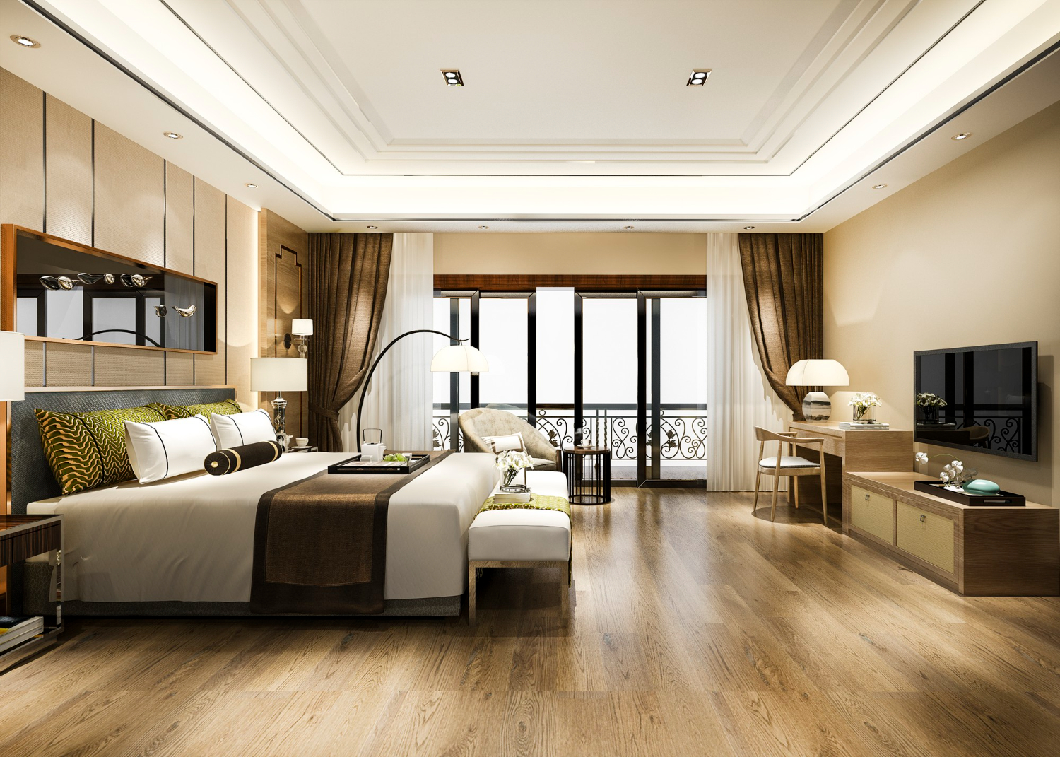
Gemona West Lifestyle is the leading luxury interior platform which is changing the way people shop and design spaces. As a key industry player, they provide a warm, worry-free, and comfortable experience that creates value for clients, from discovery to purchase through competitive pricing, unparalleled product offering and faultless customer service.
Project Overview
The scope of the project was centered around designing a seamless experience that fits into the kind of customers they serve. Their target customer is the exquisite class. A taste of luxury for furniture items and sofas. There existing website wasn’t giving that look and feel. I understood the assignment and delivered accordingly.
Problem Statement
- The existing website doesn’t have a warm, exquisite, luxurious look and feel which is germane to the kind of clients they service
- Website wasn’t converting the users into clients.
- Product catalog wasn’t representing product well with poor user experience
- Ability to customize orders before making payment was lacking
My Role
My role was to redesign the overall experience of the platform to give it the look and feel of luxury. The existing website wasn’t serving the kind of clients they have leading to low purchase. So, I conducted and examined the existing platform, carried out extensive research on it and made sure all the requirements were met.
My Process
Empathize
Conceptualize
Design
Validate
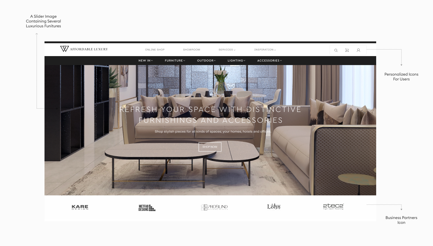
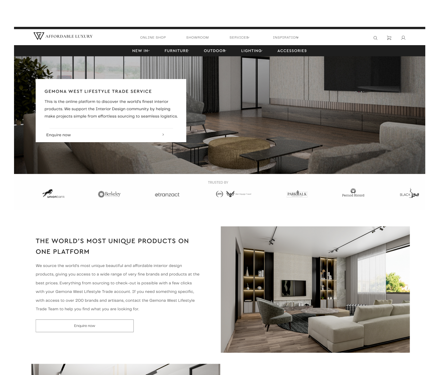
The Home Page
Recognizing the shortcomings of the existing website, my primary objective was to imbue the new design with a warm, exquisite, and luxurious look and feel. By employing a thoughtful blend of elegant aesthetics and user-centric elements, the website now radiates an inviting ambiance, captivating the visitors from the moment they arrive.The redesigned home page truly embodies the essence of luxury, while remaining intuitive and user-friendly, ensuring a seamless browsing experience for each visitor.
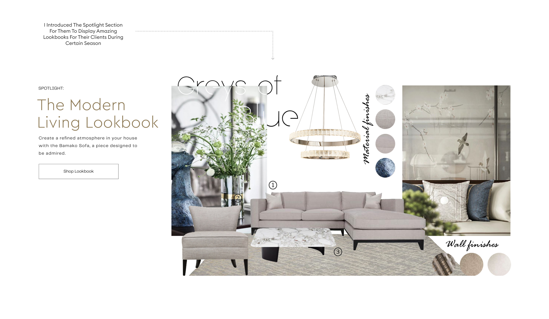
The Lookbook
Recognizing the need to elevate the website’s appeal and align it with the refined tastes of its clientele, the lookbook showcase was introduced to the homepage so that different appealing look can be made available to the customers during different occasions or seasons. The lookbook effortlessly adapts to reflect the desired ambiance, leaving a lasting impression on the visitors and inviting them to explore the exquisite world of furniture design.
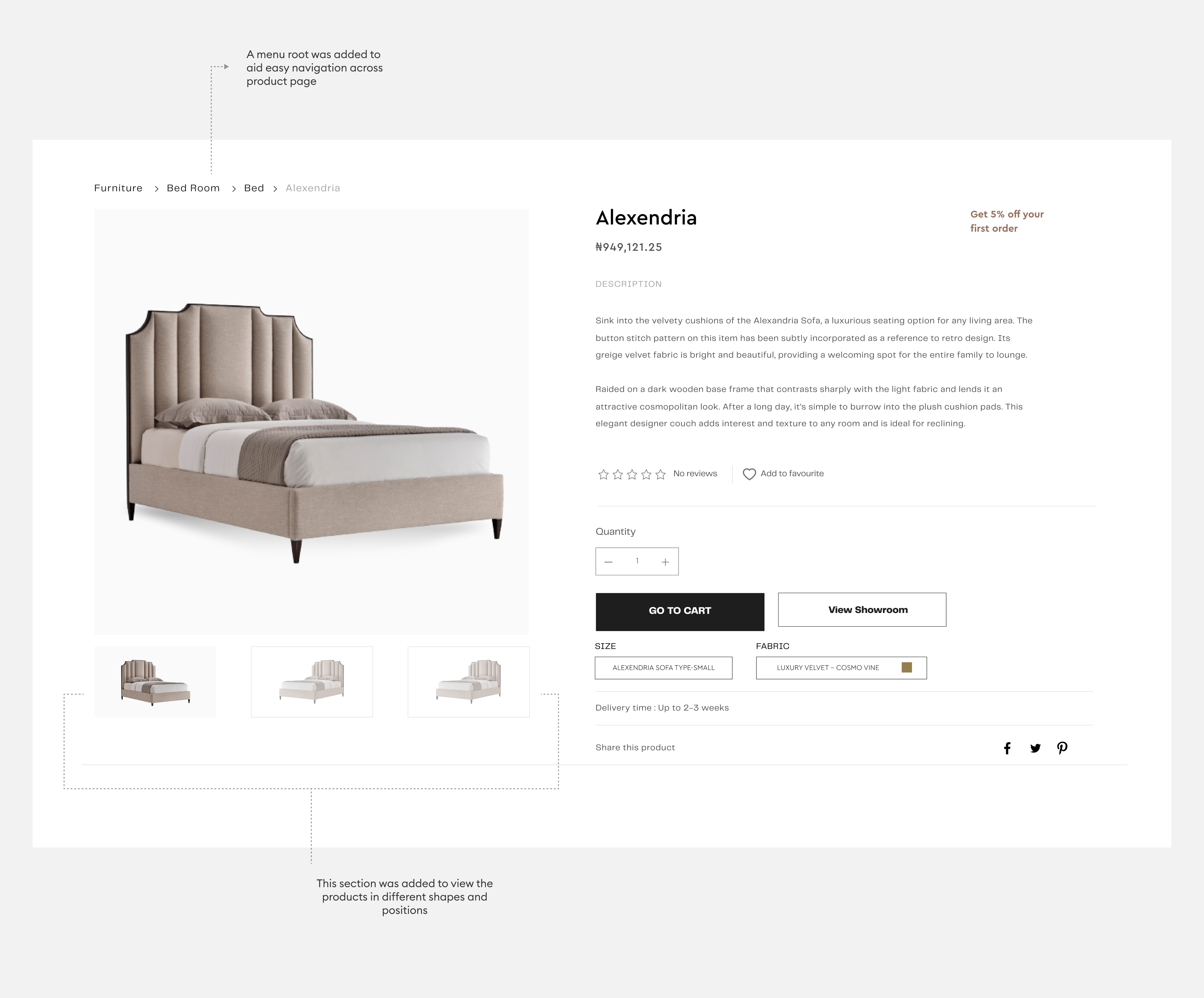
The Product Page
Recognizing the website’s underperformance in converting users into clients, my goal was to create a seamless and captivating experience that would compel visitors to make a purchase. The revamped product page addresses the previous shortcomings by ensuring a more accurate representation of each product in the catalog, accompanied by improved user experience. Through the use of high-quality images, detailed descriptions, and intuitive navigation, the product page now provides a comprehensive understanding of each furniture piece, captivating the users and instilling confidence in their purchasing decisions. Additionally, the ability to customize orders before making payments has been seamlessly integrated, allowing clients to personalize their selections and create truly unique pieces.
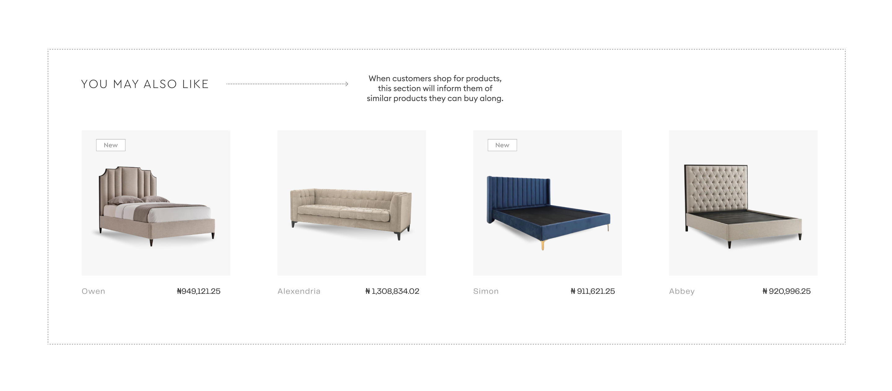
By leveraging intelligent algorithms and meticulous curation, the “You May Also Like” section offers personalized recommendations, tailored to each customer’s browsing history and preferences. This thoughtful integration not only helps customers discover complementary or alternative products but also encourages further exploration and engagement within the website.
Product Customization
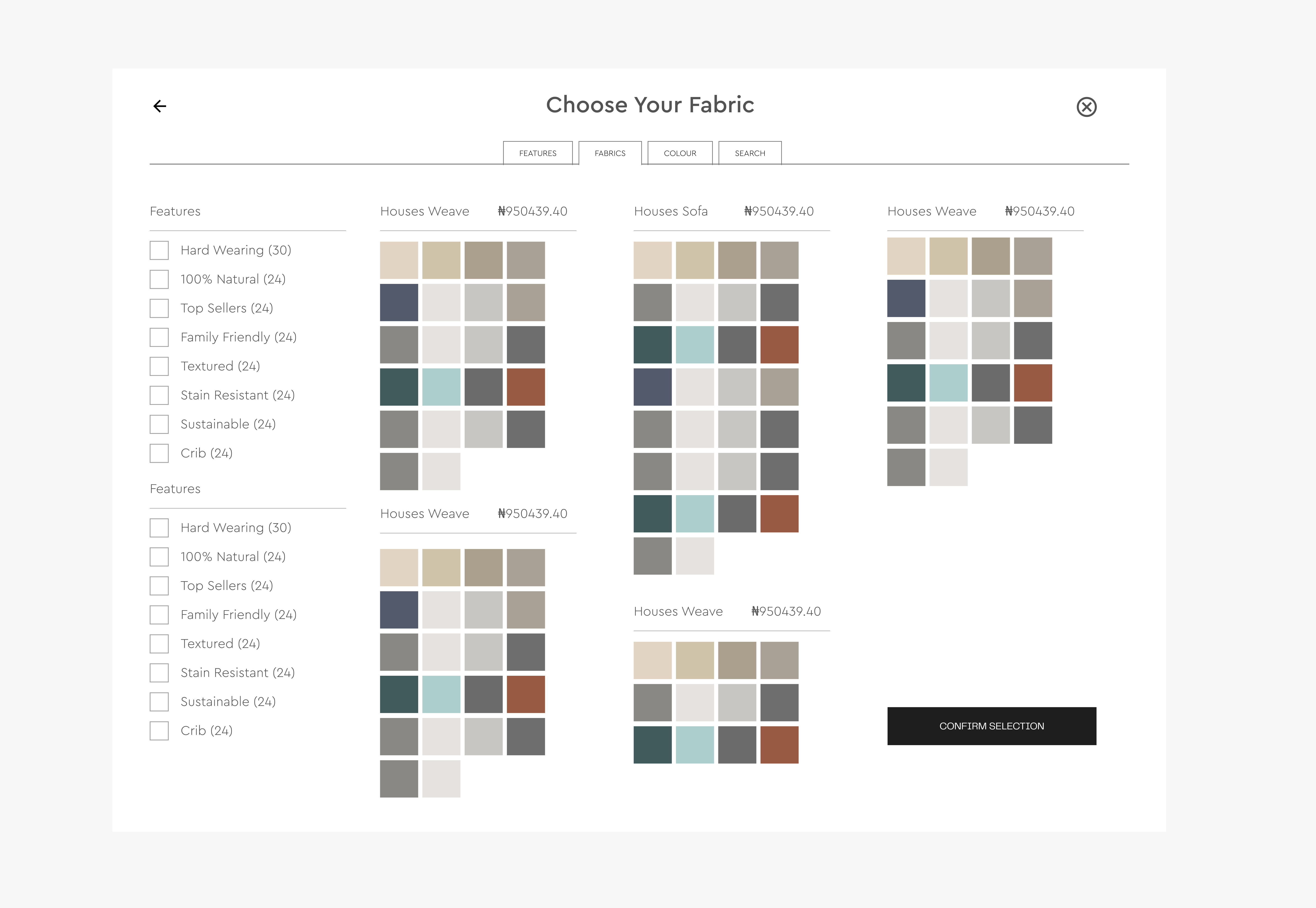
With a focus on empowering customers to create personalized pieces that perfectly suit their unique tastes, this innovative addition offers an unparalleled level of flexibility and control in the purchasing process. Now, customers have the ability to customize various aspects of the product before making a purchase, allowing them to tailor it to their exact specifications. Whether it’s selecting the fabric, color, finish, or even specific design elements, the customization options provide an immersive and interactive experience that puts the customer in the driver’s seat.
Orders and Payments
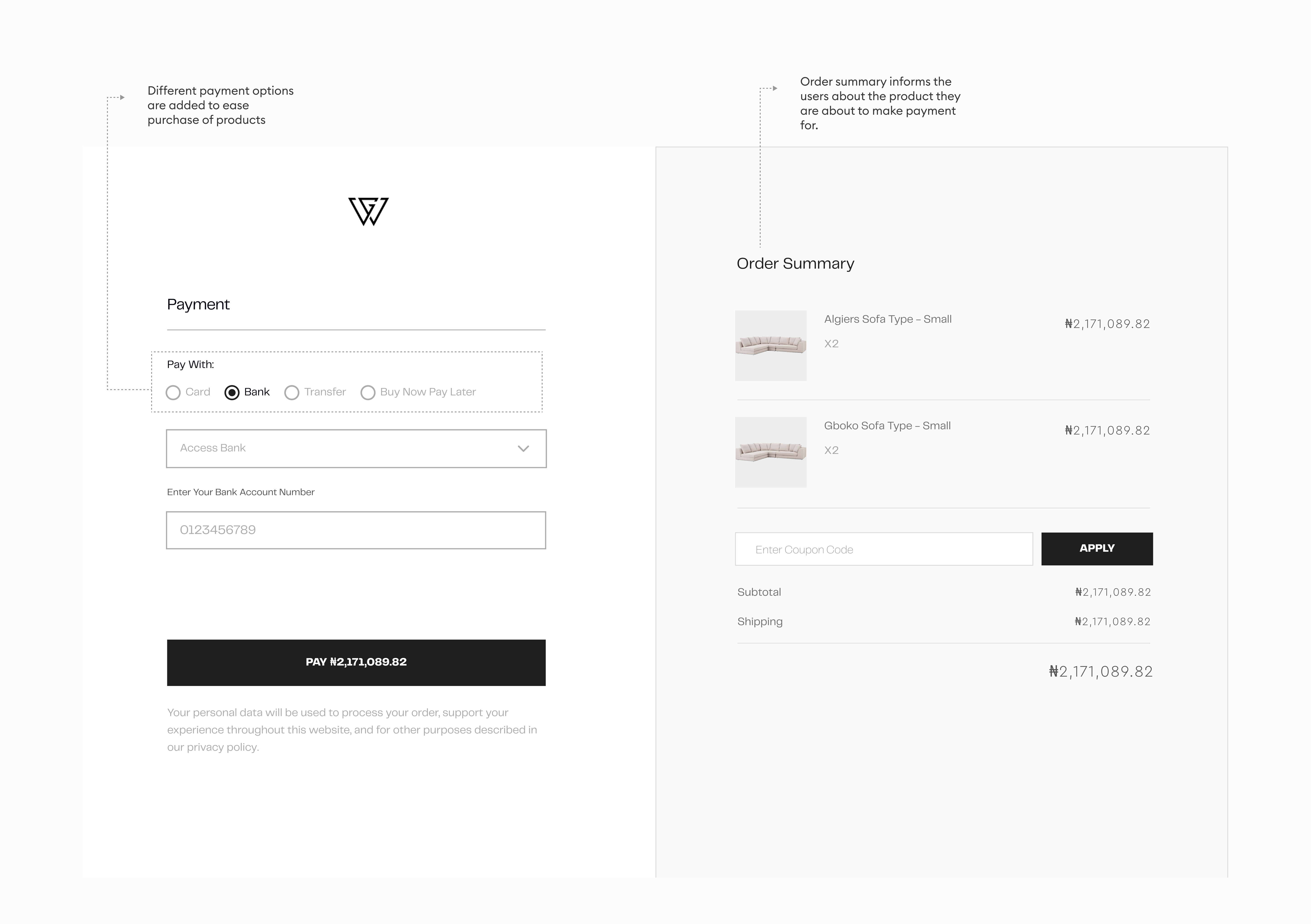
Once an order has been placed, customers are directed to the payment page, where they have a range of convenient payment options. Whether it’s paying by card, bank transfers, or utilizing the convenient “Buy Now, Pay Later”. The payment process is designed to be secure and efficient, ensuring a smooth transaction from start to finish. Additionally, to keep customers informed and in line with their order details, an order summary is prominently displayed on the payment page. This summary serves as a quick reference, allowing customers to review their selected items and associated costs before proceeding with payment.
Other Pages
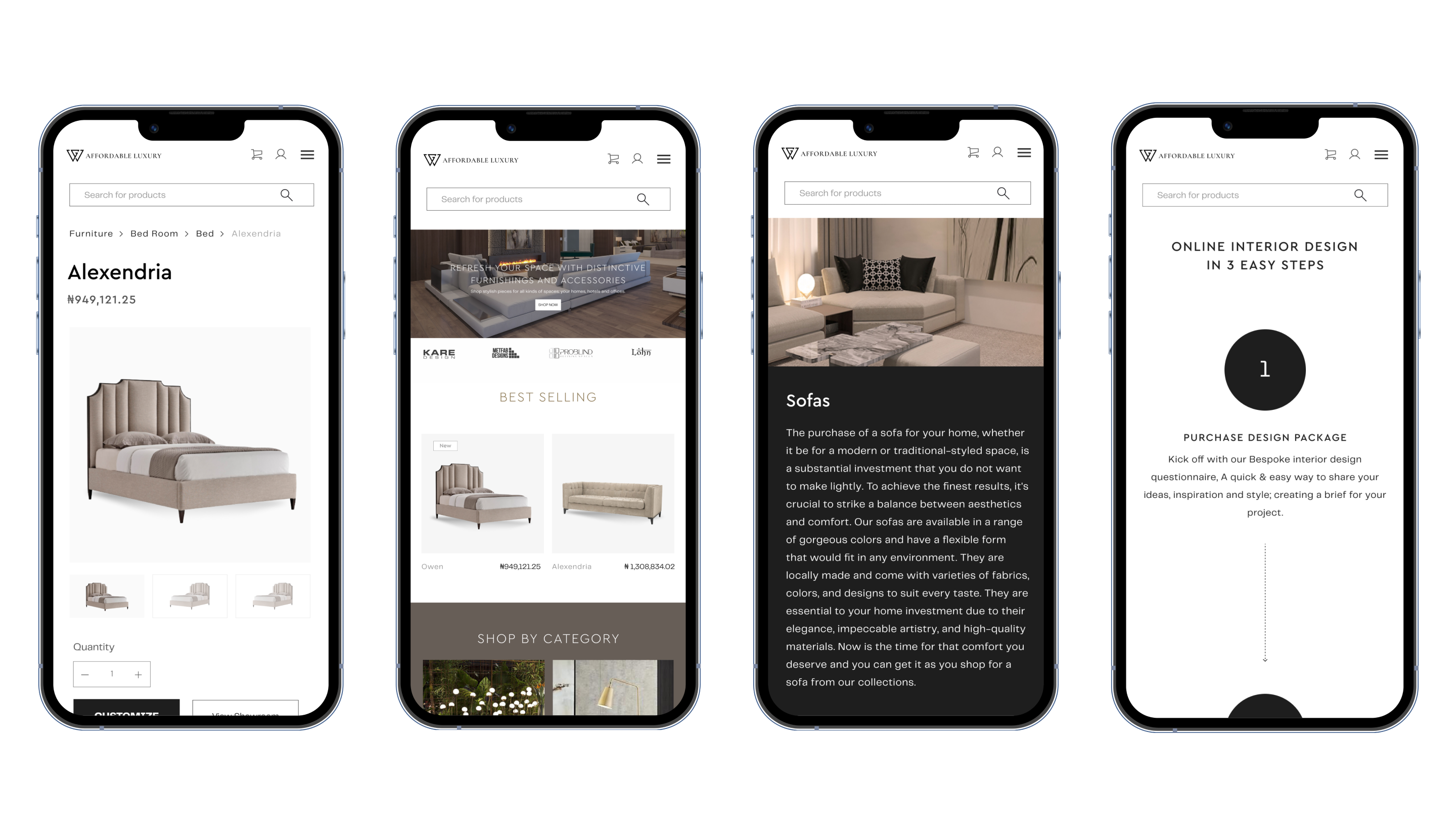
Mobile Experience
I designed a mobile experience for the entire platform to allow easy navigation for buyers as it was discovered that most of the buyers access the platform first on mobile before they finally decided to make purchase
Learnings and Outcomes
- I was saddled with the responsibility of creating a luxury furniture website that has the exquisite look and feel for a wide range of middle and high income clients base.
- The goal was to make the customers feel comfortable inspiring in them the desire to buy luxury items for the furnishing of their home. This was done by implementing design elements that communicates throughout the entire website a classic and exquisite aura by using the right colors, button designs and layout, font choice and selection and even the use of pictures
- Converting users into customers comes with a lot of design experiments and loops to see and test what works. I had to ideas, innovate and introduced several design components to make sure that this goal was achieved
